帮助学长学姐处理研究生建模题时学习的python简单处理Excel读写数据等。
从两张表中读数据进行对比并将结果写入新表
以下是两张表的表头:
less.xlsx
more.xlsx
less.xlsx的表头包含于more.xlsx的表头。要做的是取出more.xlsx表头中包含less.xlsx的那一列数据。
代码如下:1
2
3
4
5
6
7
8
9
10
11
12
13
14
15
16
17
18
19
20
21
22
23
24
25
26
27
28
29
30import xlrd
import xlwt
from openpyxl import *
file1 = "./less.xlsx"
file2 = "./more.xlsx"
workbook1 = xlrd.open_workbook(filename=file1)
sheet1 = workbook1.sheet_by_index(0)
col_name_1 = []
for i in range(1, sheet1.ncols):
col_name_1.append(sheet1.col_values(i)[0])
# print(col_name)
workbook2 = xlrd.open_workbook(filename=file2)
sheet2 = workbook2.sheet_by_index(0)
col_name_2 = []
for i in range(0, sheet2.ncols):
cols = sheet2.col_values(i)
if cols[0] in col_name_1:
col_name_2.append(cols)
# print(col_name_2)
file3 = './new.xlsx'
wb = load_workbook(file3)
ws = wb.active
for i in range(len(col_name_2)):
ws.append(col_name_2[i])
wb.save(file3)
取出来的数据写入之后是行数据而不是列。。这时候用excel的转置粘贴功能= =。行向量就转置成了列向量。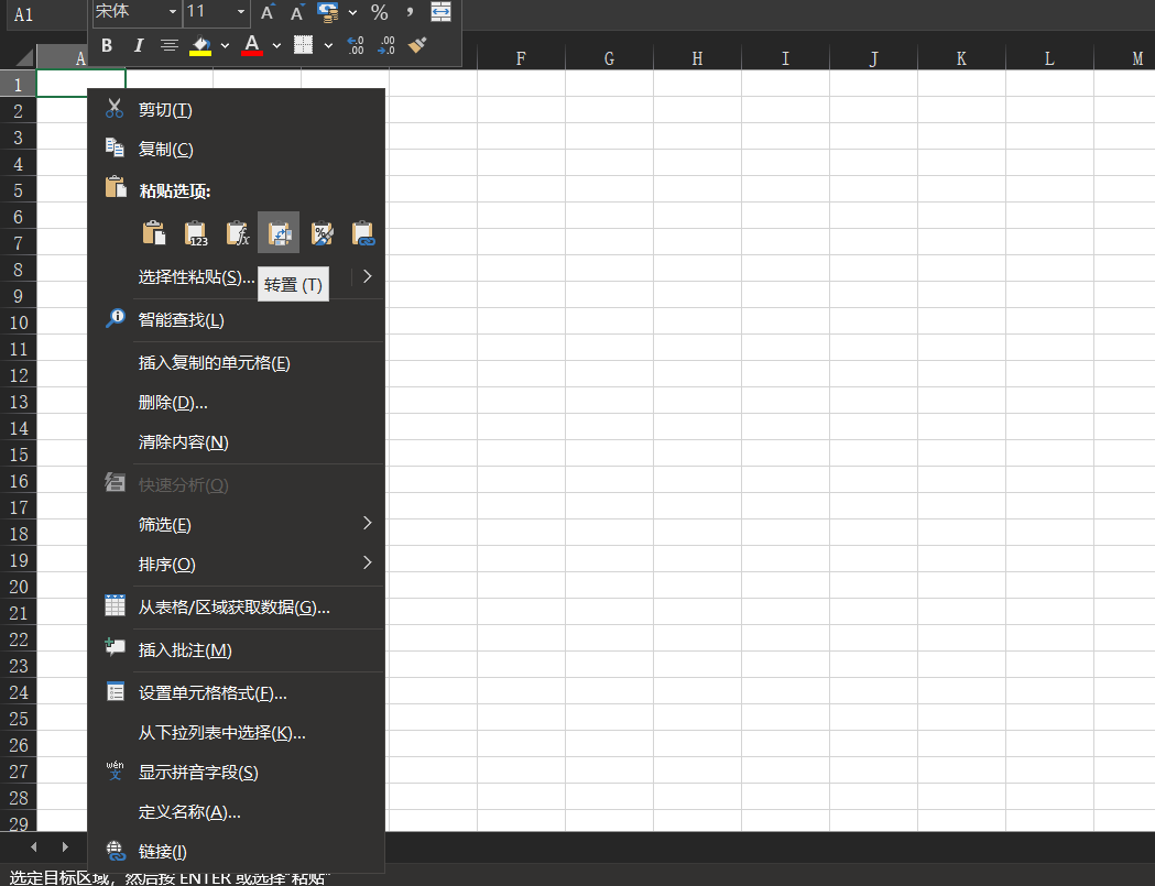
另外,有可能会报错xlrd不支持xlsx格式,需要下载对应的xlrd版本。1
2pip uninstall xlrd
pip install xlrd==1.2.0
我是在pycharm中操作的,下载的时候specify version即可。
选择数据并画正态分布图
用到了matplotlib库来画图。
安装:1
pip insatll matplotlib
在pycharm中有可能会引用报错。例如1
2AttributeError: module 'socket' has no attribute '_GLOBAL_DEFAULT_TIMEOUT'
implement_array_function method already has a docstring
百度一个方法报一个新错误。。
后来查找到一般是由于numpy和matplotlib版本不对应引起的(因为matplotlib基于numpy开发)。写的时候在命令行可以成功引用,但是pycharm中报错,查找了半天错误之后发现更新了numpy版本,卸载干净matplotlib再重装新版本就解决了。我的版本:
python 3.7.2
numpy 1.21.2
matplotlib 3.4.3
可以正常使用。
有两张表:
ERα_activity.xlsx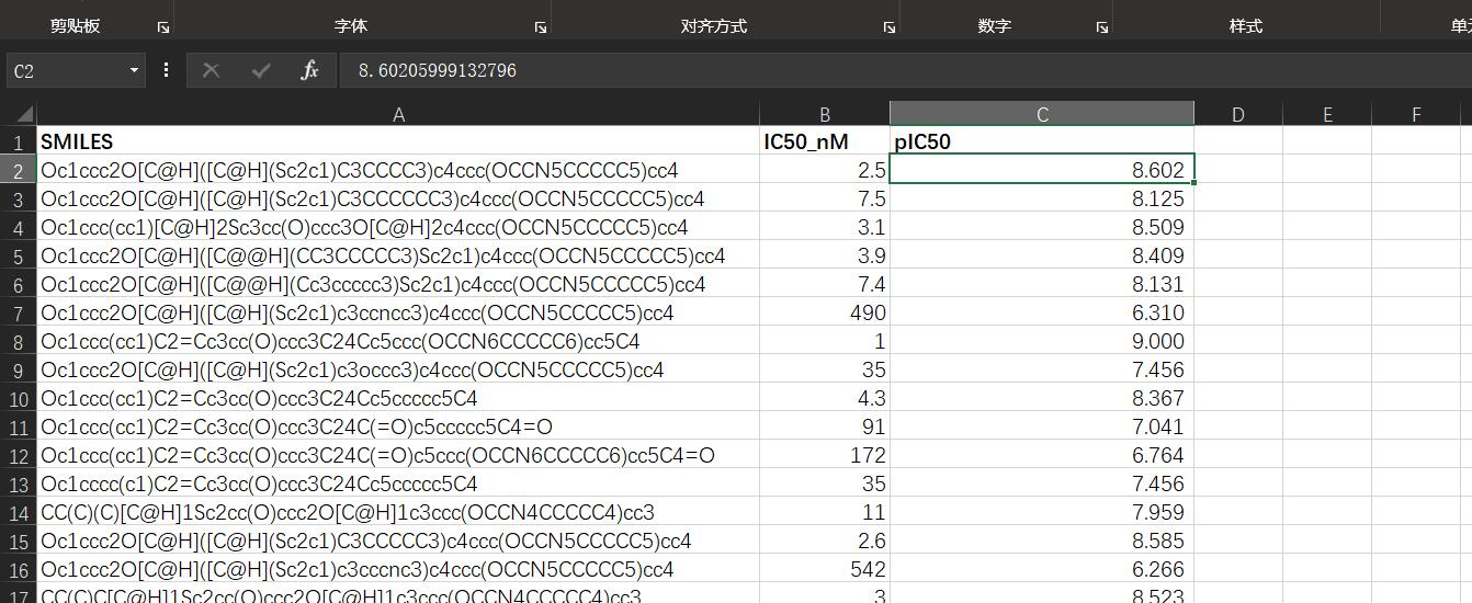
ADMET.xlsx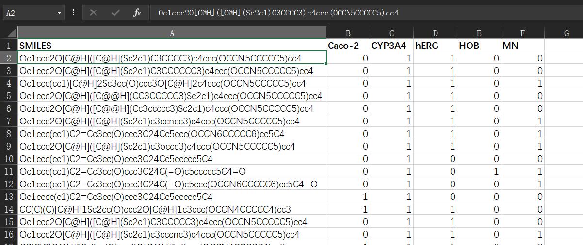
要做的是取出ADMET.xlsx中五个指标加起来大于等于3的分子式,并且这些分子式在ERα_activity.xlsx表中的pIC50值要尽量大。
其中ADMET.xlsx表中hERG和MN两个值要取反后再相加。
代码:1
2
3
4
5
6
7
8
9
10
11
12
13
14
15
16
17
18
19
20
21
22
23
24
25
26
27
28
29
30
31
32
33
34
35
36
37
38
39
40
41
42
43
44
45
46
47
48
49
50
51
52
53
54
55
56
57
58
59
60
61
62
63import xlrd
import xlwt
from openpyxl import *
import numpy as np
import matplotlib.pyplot as plt
file1 = "./ERα_activity.xlsx"
file2 = "./ADMET.xlsx"
workbook1 = xlrd.open_workbook(filename=file1)
sheet1 = workbook1.sheet_by_index(0)
pIC50_dict = {}
# 取出ERα_activity.xlsx表中的第一列分子式
for i in range(1, sheet1.nrows):
pIC50_dict[sheet1.col_values(0)[i]] = sheet1.col_values(2)[i]
# print(list(pIC50_dict.values()))
pIC50_value_list = list(pIC50_dict.values())
# 中位数
median_a = np.median(pIC50_value_list)
# 期望
mean = np.mean(pIC50_value_list)
# 方差
var = np.var(pIC50_value_list)
# 标准差
std = np.std(pIC50_value_list)
# 画出正态分布
x = np.arange(min(pIC50_value_list), max(pIC50_value_list), 0.1)
y = np.exp(-((x - mean) ** 2) / (2 * std ** 2)) / (std * np.sqrt(2 * np.pi))
plt.plot(x, y, "g", linewidth=2)
plt.show()
workbook2 = xlrd.open_workbook(filename=file2)
sheet2 = workbook2.sheet_by_index(0)
for i in range(1, sheet2.nrows):
admet = 0
for j in range(1, sheet2.ncols):
# 1,0异或1即取反
if (sheet2.row_values(0)[j] == 'hERG') or (sheet2.row_values(0)[j] == 'MN'):
num = (int(sheet2.row_values(i)[j]))^1
else:
num = int(sheet2.row_values(i)[j])
admet += num
if admet < 3:
del pIC50_dict[sheet2.row_values(i)[0]]
# 删去小于期望的分子式(按value删除字典元素)
for k in pIC50_dict.copy():
if pIC50_dict[k] < mean:
del pIC50_dict[k]
print(pIC50_dict)
list = sorted(pIC50_dict.items(), key=lambda item: item[1], reverse=True)
print(len(list))
print(list)
# print(len(list(pIC50_dict.values())))
# pIC50_name_list = list(pIC50_dict.keys())
# set1 = set(pIC50_name_list)
# set2 = set(ADMET_list)
# del_list = (set1^set2)
#
# print(list(del_list))
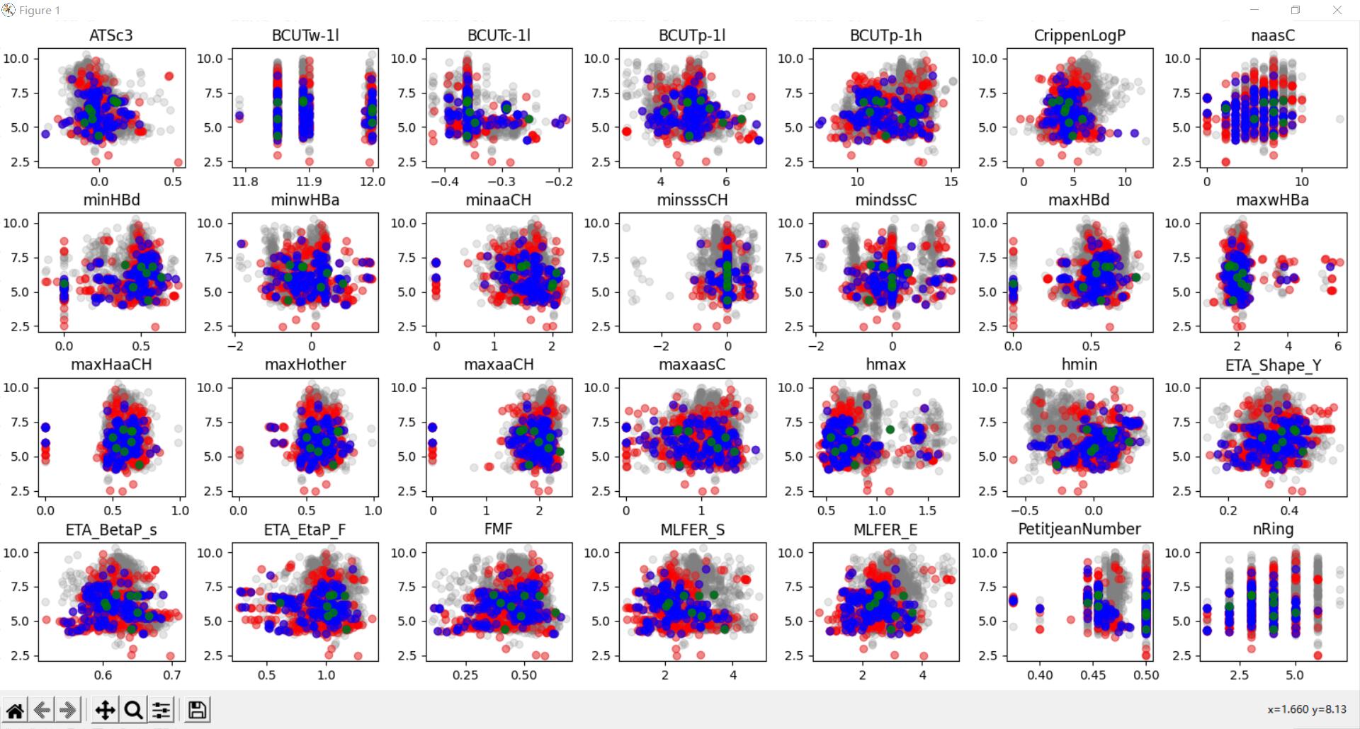
画出分层数据散点图
28.xlsx数据:
需要做的是找出每一列数据并关联num字段进行分组,染上不同颜色画出散点图。
1 | import xlrd |
效果图: